All set to scale new heights, SPF unveils its new brand identity

 Share's
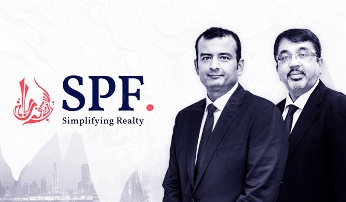
SPF, a leading real estate agency in the Middle East, has unveiled its new brand identity. This is the first time SPF has revamped its brand identity since its inception in 2006. The new identity reflects SPF’s strength and stability while sharpening its focus on property investors from international markets. The refreshed look has been designed and executed to echo the changing market dynamics of real estate sector in the region. The new identity comprises of three visual elements namely the typography, colours (white, portland orange and navy blue) and tagline “simplifying realty”. The design of the logo showcases a unique blend of tradition and modernity and speaks for the capability to reinvent themselves as per the demands of the time. Apart from representing the strength and stability of the company, the new logo signifies the quality of service provided to the clientele in the UAE and abroad. Commenting on the unveiling of the new brand identity, Mr. Kalpesh Sampat, COO of SPF, said: “This year, we celebrate our 10th anniversary, and as a symbolic gesture to mark this decade, we are giving SPF a fresh breath of life, befitting the organisation, it has grown to become. Our new brand identity signifies the contribution of the real estate market in the development of the economy. As a leading industry player, we are confident that the new brand will aid the growth and development of SPF to meet the expectations of our local and international clients on an ever-expanding canvas.” “Ten years on, having successfully established ourselves in the Dubai market, we felt that we needed to change the brand identity in order to further establish ourselves as a distinct name that reinforces the company’s focus regionally and globally, as a true thought leader when it comes to the Dubai real estate industry,” he added. Speaking on its 10-year milestone, Mr. Ranjeet Chavan, CEO of SPF, said, “SPF now has a new face, as it attains a new milestone. For 10 years, SPF has stood strong, flourishing in prosperous times and being resilient in times of adversity. We could achieve this due to the trust we have earned from our internal and external stakeholders. At the end of the day, it all boils down to our credibility. We believe it is due to the transparency and credibility of SPF’s name that our customers have stayed with us and will continue to in the future.” He emphasized that the success of SPF lies in its teamwork. “At SPF, we have geared up to meet the current requirements of the realty market, and it is the collective effort of our team. We have developed a strong reputation in the market. Our new brand identity is the representation of this trust. Since the establishment of SPF, we have systematically driven forward our robust growth strategy, with a special focus on the customer by delivering the highest quality service. We will strive for higher ideals, stay true to our deep-seated values and achieve much more as we move into the next decade,” he added. Ms. Mansi Saxena, Marketing Director of SPF, said: “The new look of SPF is a celebration of the decade we have had, and the future direction of the company. We believe that the inherent character of the new brand provides a clear direction and serves as a yardstick by which we will continue to present SPF on the global stage. The revamp of our brand identity is aimed to establish SPF as the industry leader that is, creating noticeable buzz about our services and growth. And above all, stay true to our fundamental value of always putting the customer first.” “The new SPF identity is a unique combination of a logo mark, a word mark and a tagline. In its essence, each of these elements represent core attributes of the brand. The logo mark due to its free flowing form reflects agility and excellence, the word mark defines the brand’s stability. Our tagline, ‘Simplifying Realty’, comes from the consumer insight that the world of real estate can be a complicated process. Our tagline beautifully summarises the brand motto, let us simplify your realty decisions.” she added. “SPF’s identity is built on the psychology of colours and consumer research. The logo mark is in portland orange evoking the sense of agility and growth, while the colour of the word mark is blue, in an elegant serif font showcasing credibility and heritage of the brand. These primary colours of the brand are set against a complementary pure white. Altogether, this change represents several aspects of the brand’s identity, and will become the standard used in all our future communications.” Saxena elaborated. SPF is known to set new benchmarks in the real estate consultancy service in the Dubai market and beyond. The company has achieved outstanding growth by acting as an extended arm of several premium developers in the UAE and overseas markets. The company immensely contributes to the growth and pre-eminence of Dubai among the great cities of the world. SPF has a database of 500,000 investors and buyers both locally and internationally. Since its inception, SPF has been a winner of several awards and accolades for its outstanding achievements and services in the region’s real estate sector. SPF is an esteemed member of Dubai SME One Hundred, the only one amongst real estate consultancies. With completion of ten years on the Dubai realty landscape, SPF has ambitious plans for the future, which include further strengthening of its position as the industry leader, international expansion and most importantly, simplification of realty for its valued customers.


 and tagline “simplifying realty”. \r\n\r\nThe design of the logo showcases a unique blend of tradition and modernity and speaks for the capability to reinvent themselves as per the demands of the time. Apart from representing the strength and stability of the company, the new logo signifies the quality of service provided to the clientele in the UAE and abroad.\r\n\r\nCommenting on the unveiling of the new brand identity, Mr. Kalpesh Sampat, COO of SPF, said: “This year, we celebrate our 10th anniversary, and as a symbolic gesture to mark this decade, we are giving SPF a fresh breath of life, befitting the organisation, it has grown to become. Our new brand identity signifies the contribution of the real estate market in the development of the economy. As a leading industry player, we are confident that the new brand will aid the growth and development of SPF to meet the expectations of our local and international clients on an ever-expanding canvas.” \r\n\r\n“Ten years on, having successfully established ourselves in the Dubai market, we felt that we needed to change the brand identity in order to further establish ourselves as a distinct name that reinforces the company’s focus regionally and globally, as a true thought leader when it comes to the Dubai real estate industry,” he added. \r\n\r\nSpeaking on its 10-year milestone, Mr. Ranjeet Chavan, CEO of SPF, said, “SPF now has a new face, as it attains a new milestone. For 10 years, SPF has stood strong, flourishing in prosperous times and being resilient in times of adversity. We could achieve this due to the trust we have earned from our internal and external stakeholders. At the end of the day, it all boils down to our credibility. We believe it is due to the transparency and credibility of SPF’s name that our customers have stayed with us and will continue to in the future.”\r\n\r\nHe emphasized that the success of SPF lies in its teamwork. “At SPF, we have geared up to meet the current requirements of the realty market, and it is the collective effort of our team. We have developed a strong reputation in the market. Our new brand identity is the representation of this trust. Since the establishment of SPF, we have systematically driven forward our robust growth strategy, with a special focus on the customer by delivering the highest quality service. We will strive for higher ideals, stay true to our deep-seated values and achieve much more as we move into the next decade,” he added. \r\n\r\nMs. Mansi Saxena, Marketing Director of SPF, said: “The new look of SPF is a celebration of the decade we have had, and the future direction of the company. We believe that the inherent character of the new brand provides a clear direction and serves as a yardstick by which we will continue to present SPF on the global stage. The revamp of our brand identity is aimed to establish SPF as the industry leader that is, creating noticeable buzz about our services and growth. And above all, stay true to our fundamental value of always putting the customer first.”\r\n\r\n“The new SPF identity is a unique combination of a logo mark, a word mark and a tagline. In its essence, each of these elements represent core attributes of the brand. The logo mark due to its free flowing form reflects agility and excellence, the word mark defines the brand’s stability. Our tagline, ‘Simplifying Realty’, comes from the consumer insight that the world of real estate can be a complicated process. Our tagline beautifully summarises the brand motto, let us simplify your realty decisions.” she added.\r\n\r\n“SPF’s identity is built on the psychology of colours and consumer research. The logo mark is in portland orange evoking the sense of agility and growth, while the colour of the word mark is blue, in an elegant serif font showcasing credibility and heritage of the brand. These primary colours of the brand are set against a complementary pure white. Altogether, this change represents several aspects of the brand’s identity, and will become the standard used in all our future communications.” Saxena elaborated. \r\n\r\nSPF is known to set new benchmarks in the real estate consultancy service in the Dubai market and beyond. The company has achieved outstanding growth by acting as an extended arm of several premium developers in the UAE and overseas markets. The company immensely contributes to the growth and pre-eminence of Dubai among the great cities of the world. SPF has a database of 500,000 investors and buyers both locally and internationally.\r\n\r\nSince its inception, SPF has been a winner of several awards and accolades for its outstanding achievements and services in the region’s real estate sector. SPF is an esteemed member of Dubai SME One Hundred, the only one amongst real estate consultancies. With completion of ten years on the Dubai realty landscape, SPF has ambitious plans for the future, which include further strengthening of its position as the industry leader, international expansion and most importantly, simplification of realty for its valued customers.)